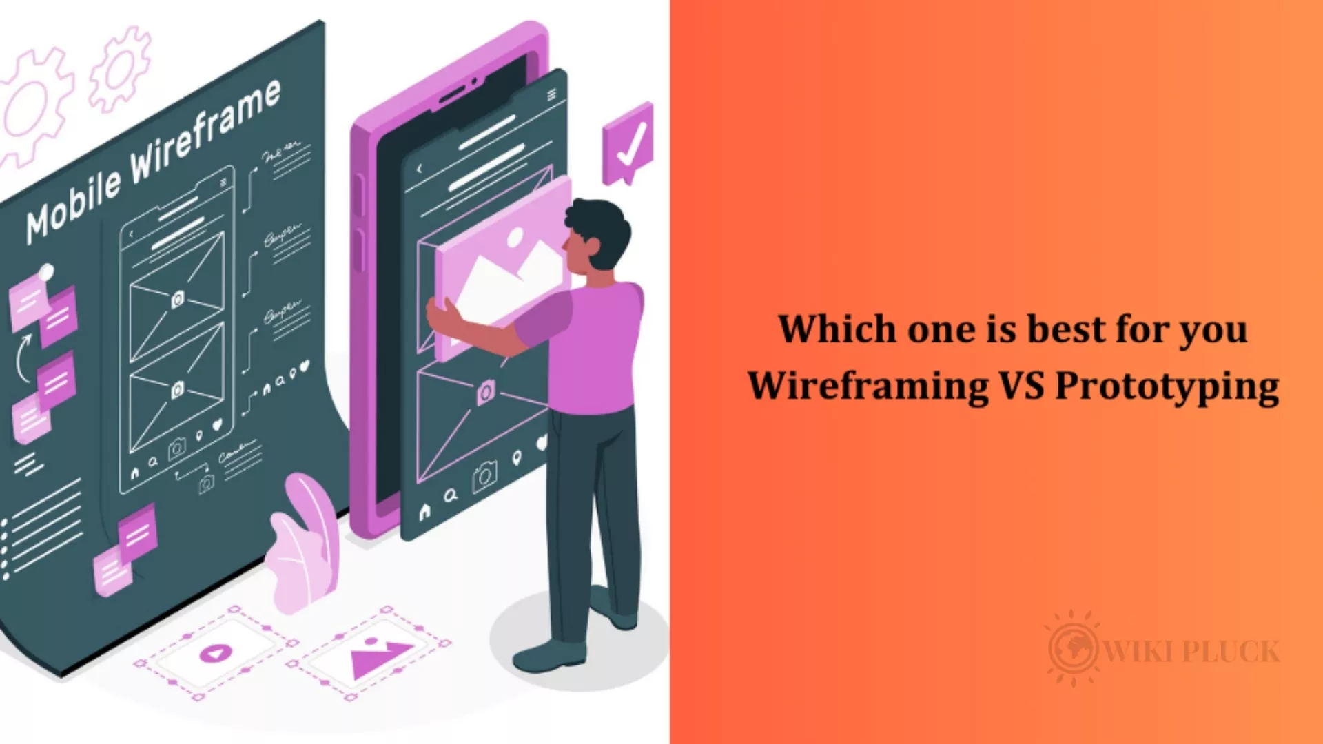
In the digital design realm, wireframing and prototyping reign supreme as crucial tools for shaping innovative interfaces. But when it comes to choosing the champion, the “best” depends on the stage of your battle, or rather, your design journey.
Both approaches wield unique strengths and weaknesses, demanding a nuanced understanding to wield them effectively. So, let’s embark on a deep dive into this dynamic duo, unraveling their capabilities and guiding you towards the perfect match for your needs.
Ready to say goodbye to static mockups and hello to interactive prototypes? Dive into our How We Work page and unlock the secrets of our design magic.
Wireframing: The Agile Architect
Imagine a quick, minimalist sketch, a conceptual map outlining the skeleton of your digital interface. That’s the essence of wireframing. Think of it as the agile architect, swiftly laying down the foundation of your design – the layout, content hierarchy, and basic functionality.
Strengths:
Speed Demon: Time is of the essence, and wireframing sprints to the forefront. With tools like pen and paper or digital sketching apps, you can whip up layouts in a flash, ideal for brainstorming sessions and early discussions.
Communication Catalyst: Stakeholders often struggle with abstract concepts. Wireframing acts as a bridge, providing a clear, visual representation of your ideas, facilitating feedback and fostering collaboration.
Laser Focus: The beauty of simplicity lies in its clarity. Wireframes strip away visual distractions, forcing the focus on core functionality and user flow. This laser-sharp approach helps refine the structure before getting bogged down in the details.
Weaknesses:
Muted Interactivity: Like a static picture, wireframes lack the dynamism of real-world interaction. Buttons may sit frozen, transitions remain unseen, and the user experience stays largely unexpressed.
Abstraction’s Double-Edged Sword: While simplicity aids communication, it can also create a disconnect from the final product. Stakeholders might struggle to envision the full visual experience or user engagement.
Usability Testing: A Bridge Too Far: Forget about realistically testing user journeys or uncovering navigation hiccups. Wireframes simply don’t offer the interactive playground needed for comprehensive usability testing.
Also Read: 8 Awesome Useful APIs for Web Developers & Designers
Prototyping: The Interactive Storyteller
Now, imagine stepping into a playable demo, where your interface comes alive. Interactions shimmer, animations dance, and every click unlocks a new chapter in the user experience.
That’s the magic of prototyping – it transforms static structures into immersive stories.
Strengths:
Communication on Steroids: Forget static explanations; prototypes let stakeholders actually navigate, tap, and interact with your design. This tangible experience fosters deeper understanding and more informed feedback.
Usability’s Early Warning System: No need to wait for launch to unearth navigation pitfalls. Prototypes enable early usability testing, allowing you to identify and address user pain points before they become launch-day disasters.
Interactivity Unveiled: Animations, transitions, and micro-interactions come alive, revealing the dynamic soul of your interface. This not only refines the user experience but also sets the stage for visual design decisions.
Weaknesses:
Time Investment Monster: Unlike the swift strokes of a wireframe, prototypes demand more time and effort. Visual fidelity, interactivity, and polish all contribute to a longer creation process.
Over-design’s Siren Song: The allure of bells and whistles is seductive. But focusing solely on visual flourishes in prototyping can distract from core functionality and lead to premature design decisions.
The “Fake It Till You Make It” Trap: High-fidelity prototypes can be so convincing that stakeholders mistake them for the final product. Setting realistic expectations and emphasizing the iterative nature of design is crucial.
The Winning Alliance: Wireframing and Prototyping, Hand in Hand
Think of wireframing and prototyping as partners in crime, each playing a vital role in shaping a successful digital interface. Here’s the winning strategy:
Wireframing First: Lay the foundation. Use wireframes to solidify the core structure, user flow, and information architecture. This ensures a strong skeleton before adding the flesh and blood of interactivity.
Prototyping for Refinement: Once the core is defined, it’s time to breathe life into it. Prototypes add visual fidelity, interactivity, and user testing, refining the details and polishing the user experience.
Also Read: The Ultimate Guide to Developing the Perfect Mobile App
Remember, the choice isn’t a zero-sum game.
It’s about understanding the strengths and weaknesses of each approach and wielding them strategically at the right stage of your design journey.
By embracing both wireframing and prototyping, you equip yourself with the tools to craft engaging, user-centric interfaces that stand the test of time and delight your users.
So, unleash the agile architect and the interactive storyteller within you. Together, they’ll lead you to design victory!
Zalak Shah is the Vice President of Software Development at Covrize. With 19 years of experience working in different IT industry domains, he has extensive knowledge to bridge the gap between businesses in both the tech and non-tech sectors.

